- June 19, 2026

-
-
Loading
Loading
If Sarasota is to dream large, the city’s official seal, and maybe eventually its logo, should reflect those ambitions. That’s the consensus among the Sarasota City Commission, which received a report containing nearly 200 city seal contest submissions from citizens and others during a meeting on Monday.
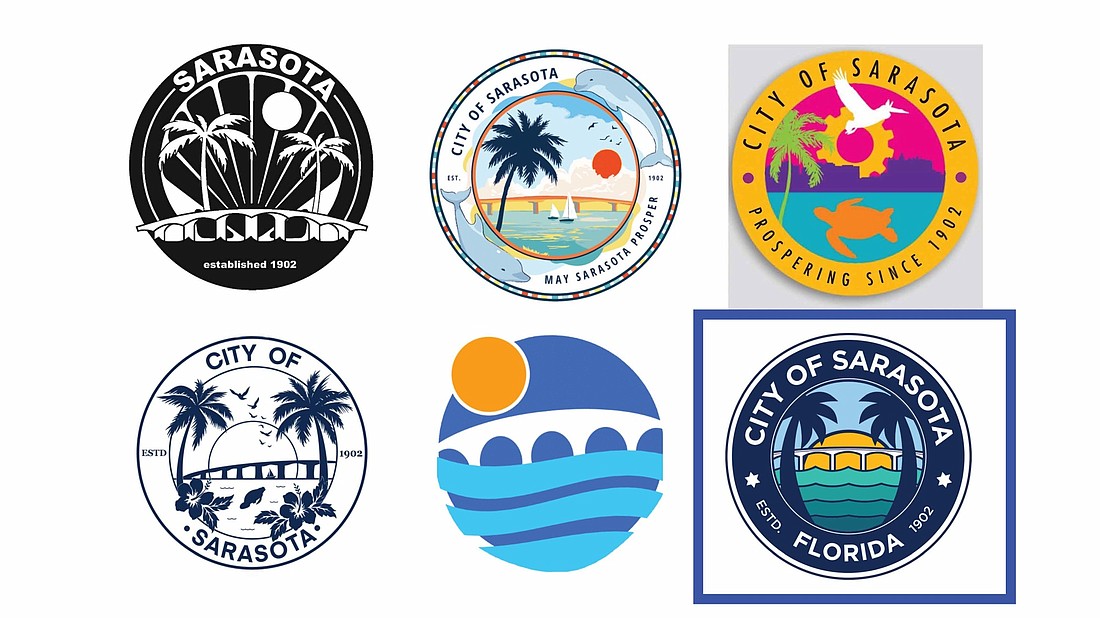
After more than 2,500 responses to a community survey and 172 seal submissions from the public, Dream Large, a Sarasota-based benefit corporation, presented to city commissioners five preferred new city seal design concepts, plus its own composite synthesized from the most commonly referenced elements: nature, water, sunset and the Ringling Bridge.
Dream Large conducted a public engagement process from June 1 to mid-July, which generated clear recurring themes, said Sarasota Government Relations Manager Stevie Freeman-Montes. On Monday, Dream Large presented all the seal submissions, highlighting five favorites selected by a 12-member panel, seeking guidance from commissioners on the next steps in the process.
In November 2021, commissioners authorized the city to enter into a $25,000 contract with Dream Large to reimagine the current, rudimentary seal. The company took the process to the public with a survey and the design contest. Applications of the seal may include marketing and branding materials, signage and official city documents.
The first step was separating the seal from the city's logo, the latter featuring a silhouette of Michelangelo’s famous David statue, a 16-foot-tall copy of which stands in the courtyard of the John and Mable Ringling Museum of Art. The current circular seal features a sketch of sun, trees and marine life that may or may not be a manatee or mullet, all surrounded by the words “May Sarasota Prosper” and “1902,” the year the city was founded.
Sarasota has prospered, and commissioners were clear about removing that verbiage during Monday’s discussion.
“When you think about brands, your brand is what people say about you when you're not in the room,” said Dream Large founder Anand Pallegar. “In the general public, I think there was a little bit of learnings about the history of the seal versus the logo, and so what we really aimed to do was to focus on the seal and solicit public input, drive a design process with the community, and produce outcomes.”
Pallegar then offered a forecast of future engagement.
“We will get to the logo next time around,” he said.
Commissioners did identify other submissions beyond the five panel selections, but seemed to find consensus on one that breaks the circular mold — an image of the iconic tower at Ca' d’Zan, the Mediterranean revival mansion on Sarasota Bay built in the mid-1920s by John Ringling. The tower is wrapped by a sunburst above stylized “City of Sarasota” lettering.
Commissioner Hagen Brody suggested that submission may be more appropriate as a logo.
Three of the five favorites selected by the panelists are highly colorized designs, the two others monochrome, the latter suggested as more practical given reproduction capability over a variety of mediums from street signs to letterhead. Four of them evoked images of the bridge between downtown and Lido Key, one updating the verbiage to “Prospering Since 1902.”
Dream Large also produced a composite design that included the commonly recurring elements, honing in on palm trees, the bay, the bridge and the sunset. It’s also the only design that included the word “Florida.” Commissioner Liz Alpert said if they were to take an immediate vote, she would select the composite.
Not so fast, though.
“What we're looking for today is is there agreement from you with respect to these themes being conveyed in the seals.” Palleger said. “Do you feel like this is representative of the city, number one. Number two, are there any others you've identified yourselves that you would care to kind of have us consider and look at in terms of the next step?”
Options for the next step, Pallegar said, are varied. Dream Large could further refine its synthesized logo while crediting the artists of the five favorites for the design elements, or it could consult with those five artists on alterations to their original submissions.
“Why not take these and put them out there and see what the community thinks?” Brody asked.
Palleger agreed that public input should play a role in the refinement, and expressed hope that a decision may be made the next time he appears before the commission.
“Our objective would really be to try and synthesize this down to bring something back that is clear, standardized, that a decision can be made upon,” Palleger said.


