- June 26, 2026

-
-
Loading
Loading
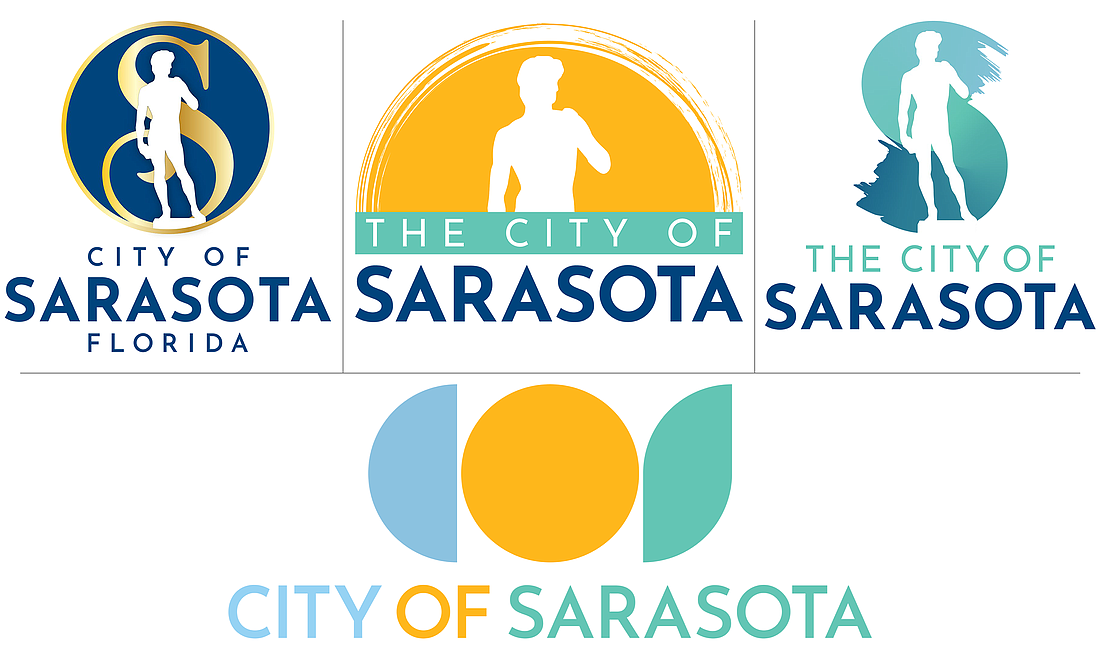
By 1988, Sarasota was fully immersed in its identity as a city of the arts. So its leaders at the time decided to adopt a silhouette of the famous — some might say infamous — bronze replica of Michelangelo’s statue of David, which stands in the courtyard of The Ringling Museum of Art, as central to the city logo.
With David peering over their shoulders on April 15, as he always does during City Commission meetings from behind the dais, current leadership debated whether he should remain as the iconic symbol of the city, or be replaced by something more contemporary.
After contracting Sarasota-based branding and marketing firm DreamLarge to guide the city through a new city seal design process in 2022, it went in-house to create a new logo, tasking Marketing and Outreach Coordinator — and graphic artist — Ciera Coleman, for the work.
Her assignment was threefold: refresh David, modernize David, and something else entirely.
The April 15 meeting was the first opportunity for commissioners to officially discuss the project with Coleman. They first saw a range of concepts from all three options during a Feb. 12 informal workshop, when they offered suggestions for refinements. At both the workshop and the most recent meeting, they clearly leaned toward “something else,” a geometric acronym for City of Sarasota, the letters COS evoking the city’s role in contemporary architecture, eschewing centuries-old art.
But they also weren’t ready to dump David just yet.
“David is unique to Sarasota,” Vice Mayor Jen Ahearn-Koch said. “It’s the only one that exists in the hemisphere to have that exact size and material, so it is a unique piece of art.”
Mayor Liz Alpert, though, is clearly opposed to David as the city’s ongoing identity, going so far as to say she never wants to see it in any future designs.
“I went into this thinking we should never get rid of the David because it's such a unique thing,” Alpert said. “I don't want to see David again. I'm looking at these other iterations and I'm just like, what is this doing there? I just think we should just do a total rebrand and get rid of the David in my view.”
While her colleagues at the dais were divided on that point, they appeared to be open to suggestion.
Commissioner Erik Arroyo was ready to move forward with “something else.” Ahearn-Koch and Debbie Trice wanted to see refinements of a couple of David options — perhaps incorporated into a more modern approach — while Kyle Battie appeared planted firmly in the middle.
“David has become so iconic that it is recognized probably even outside of the state of Florida,” Trice said. “I'm wondering who is the audience for this logo? Is it so the people at the city of Sarasota can say, ‘rah, rah, we've got a pretty logo,’ or is it representing the city in the wider scope of the state and possibly beyond the state?”
Among Coleman’s design options in the Refresh David category was the full-length statue superimposed over a stylized capital S, which she noted appears to give him a tail. Ahearn-Koch and Trice referred to it as “Snake David,” which sealed the fate of that prospect.
There was some consensus to a concept of David superimposed over what could be described as an ocean wave or a paint brush stroke, evoking two notable identifying characteristics of the city. The motion eventually made by Trice, included some refinements to that concept.
Similar to the Feb. 12 workshop, though, the momentum moved toward the COS concept, which Coleman said offers versatility in branding various departments and events with images contained within the geometric shapes. It also brings the city into the 21st century, and responds to public input that the city’s identity has now advanced beyond only the arts.
“Being a city with so many accolades, we do have now a worldwide audience, which could be argued as a reason to want to have a logo that is not potentially mistaken for Florence, Italy,” Coleman told commissioners. "It gives us a lot of opportunity to utilize it in ways that are very dynamic and could be representative of not just one aspect of the city.
“The amount of answers that we received with regard to what Sarasota means to people was so varied, and this is something could potentially encompass all of those things.”
That approach resulted in designs that can include David as part of Sarasota’s identity rather than the entirety of it. In addition, the COS concept offers branding opportunities that look toward the future while also incorporating the city’s history.
“We wanted to design a logo that is modern, dynamic, creative and unique to showcase the city of Sarasota as an arts leader, highlight our city's natural features and beauty, honor our city's unique history and look toward an aspirational future,” Coleman said. “We'd also like to create some congruency with the city seal and the overall brand identity of the city."
That congruency is found in the color palette of the design produced by DreamLarge, that concept incorporating public participation in the form of a design contest from which elements were curated to achieve the finished product.
Setting no time frame to revisit the logo, commissioners instructed Coleman to bring back five options with further refinement and to facilitate additional public input. To the latter, City Manager Marlon Brown pointed out no members of the public signed up to speak on the subject, but that Coleman will forge ahead.

“We’re still trying to make everybody happy,” Coleman said. “We’ll see how that goes.”
Universal bliss notwithstanding, once a new logo is selected the rebranding process can take years, perhaps as many as five, to fully implement across the city’s many assets. For example, regularly scheduled replacements, such as signage, that are regularly budgeted can be transitioned gradually rather than absorbing 100% of the costs at one time and out of phase.
“We are proposing a phased approach, which would be over the course of maybe three to five years,” Government Affairs Director Jennifer Jorgensen told commissioners. “From a cost perspective, doing a phased approach also allows us to utilize operational budgets and operational expenses that are already out there for a brand refresh. It's already in the budget, so that is what we would be proposing for any phased logo transition for this situation.”