- July 2, 2026

-
-
Loading
Loading
“So we’re back to talk about the mullet and Michelangelo.”
That’s how Anand Pallegar, founder of Sarasota registered benefit corporation Dream Large, opened the discussion with Sarasota city commissioners about the redesign progress of the city of Sarasota’s official seal and logo.
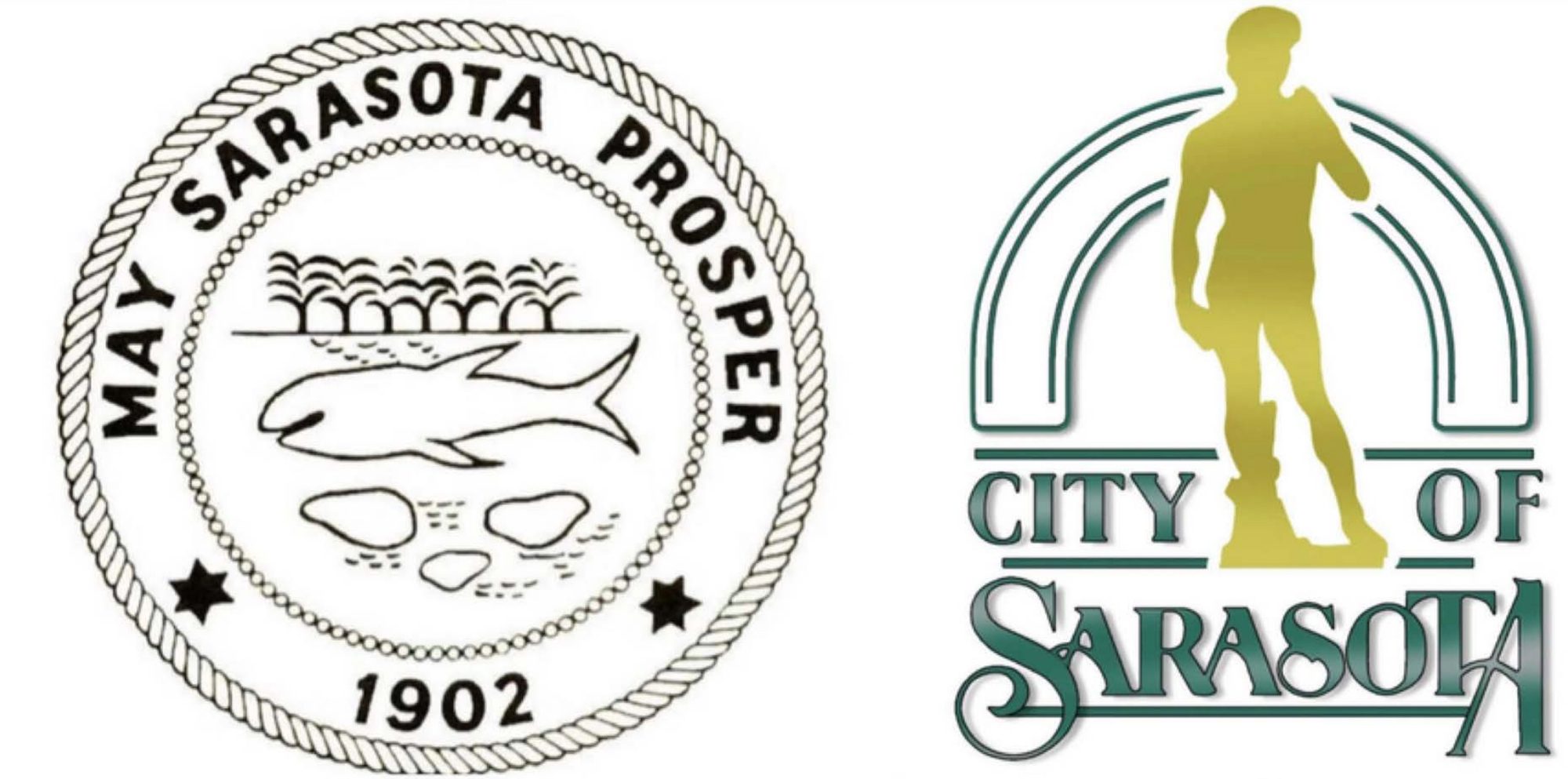
“Mullet” refers to the seal, a simple, hand-drawn circular design dominated by what may be a manatee, but could arguably be a whale, a shark and, sure, even a mullet. The dominant feature of the city’s logo, which is separate from the seal, is a silhouette of Michelangelo’s sculpture of David, a copy of which stands as the centerpiece of the Ringling Museum of Art.
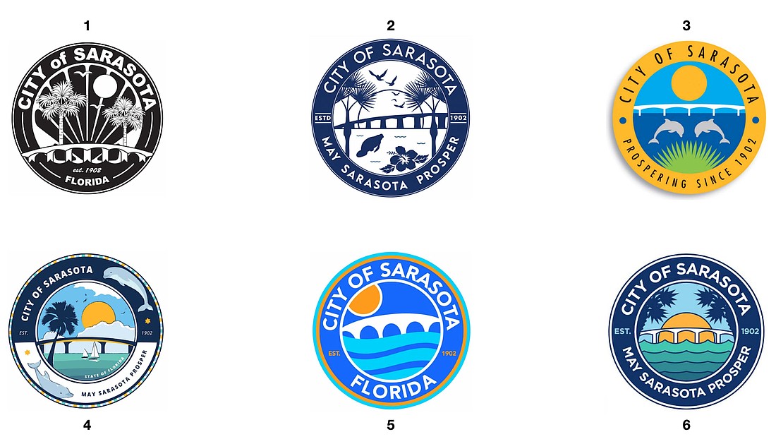
At their Aug. 1 meeting, Pallegar presented to commissioners five city seal design finalists plus a version produced by Dream Large, the latter a hybrid of common elements among the five. Commissioners offered suggestions and asked Anand to return with refinements.
Those changes, which were made by the submitters, primarily focused on simplifications in color and detail to enhance feasibility of use of the seal in a variety of mediums. Other tweaks included incorporating native palms and font legibility, all while still maintaining the integrity of the original designs.
“These individuals really have put in the time and effort and really for no guarantee of anything other than they want to participate,” Pallegar said. “This is their civic contribution toward furthering our city.”
The Dream Large community campaign generated 148 submissions with 172 designs, judged by a diverse panel of varying backgrounds to rate the designs on aesthetics, themes, legibility and functionality for use on business cards, letterheads and badging where a seal is deemed appropriate. Pallegar identified the finalist designers as Cynthia Clasgens, Rachel Ewing, Bill Greaves, Sara Scire and Brooks Tracey.
Commissioners narrowed the choices down to two:
Another favorite among commissioners, particularly Mayor Erik Arroyo and Commissioner Liz Alpert, was a whimsical image of the Ringling Bridge beneath an orange sunset and two-tone blue water by Brooks Tracey.
“The colors are so vibrant,” Alpert said. “They just make you happy looking at it.”
That one didn’t make the final cut, though, as applications of a city seal are often official and serious in nature. In many ways, it serves as the city's brand.
Both finalist seals include the verbiage “May Sarasota Prosper” at the bottom, as does the city’s century-old seal. Among the alterations commissioners requested was a better sense of scale between the manatee and the hibiscus in Ewing’s submission and simplification of colors in the waves of the Dream Large hybrid design.
With the new seal design nearing conclusion, Pallegar and Dream Large will turn their attention toward the city’s logo, a silhouette of the David statue set against stylized “City of Sarasota” lettering. Commissioners’ guidance on that project
“Do we modernize a version of David, come back with another version of David or are you open something else?” Pallegar asked.
All of the above, as it turns out, is the guidance.
“I think people, and I think this body would want to see all three of these,” Commissioner Hagen Brody said. “I don't know how you do a modern David. I really don't know what that means. But I would be open to something else. You guys are the creative ones that we hired to do this, and I think that the public outreach is really important and it brings creative elements that would work just like we experienced with the seal.”
Commissioner Jen Ahearn-Koch, who reminded she was not in favor of the project to redesign the seal and logo, suggested the community feedback already gleaned may be a good starting point. Many people, after all, were unaware of the difference between the seal and the logo anyway.
“I would go back to that and use some of that as guidance,” she said. “There were some positive comments. There were some negative comments. There were some comical comments. There were some worrisome comments. My recommendation would be to parse through that. There are some some good suggestions in there and some valuable feedback.”
No date was set for Pallegar to return to the commission with seal refinements or logo designs.