- June 19, 2026

-
-
Loading
Loading
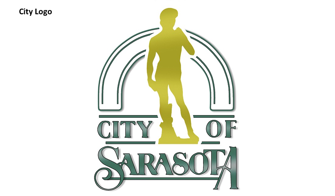
Does David represent the city of Sarasota?
That’s a subject of disagreement among city officials and a question that will get further consideration as staff explores the possibility of revising the city’s logo and seal.
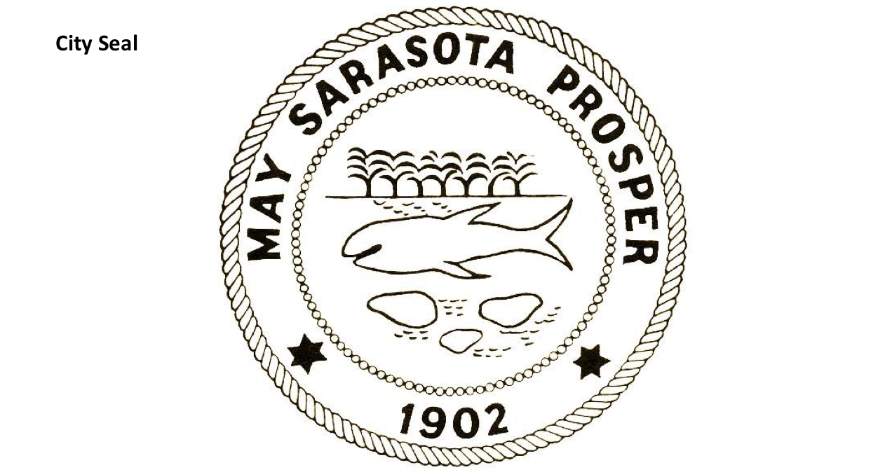
On Monday, the City Commission voted 4-1 to consider possible changes to the city’s iconography. The logo features a silhouette of the statue of David, the iconic Michelangelo sculpture with a replica located at The Ringling. The seal highlights marine and coastal imagery with the text “May Sarasota Prosper.”
Mayor Hagen Brody placed an item on the commission’s agenda advocating for the exploration of new branding for the city. Brody said he felt both the seal and the logo were dated.
The commission was divided on the aesthetic merits of the David logo. Commissioner Jen Ahearn-Koch said she felt strongly about maintaining the logo, citing the sculpture’s history in Italy and the symbolism connected to the story of David. Commissioner Liz Alpert said she liked featuring David because it spoke to Sarasota’s pride in its arts community.
City Manager Marlon Brown said he felt the sculpture did not speak to Sarasota specifically. He also cited a practical issue the city has encountered with the logo, noting the Sarasota Police Department does not use it because the image led to too many vandalism incidents.
“It is strange to me as a manager to not have a department using that logo,” Brown said. “That speaks to something about the logo.”
No commissioner offered a strong defense for the design of the existing seal.
“It looks like a seal — like a dead seal,” Commissioner Kyle Battie said.
Ahearn-Koch expressed concern about the costs associated with updating the city’s logo and seal imagery, suggesting it was not an appropriate time to embark on the endeavor with the city still facing pandemic-related budget challenges.
“We don’t have to commit to anything,” Commissioner Erik Arroyo said.
What do you think: Should the city change its logo? Click here to answer!


