- April 19, 2024

-
-
Loading
Loading
Trust me you’ll get used to it — our new design.
Think of it this way: The same Tide, with the same cleaning power, just in a new container.
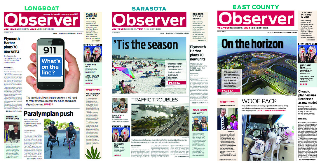
It’s the same Observer, with the same local content, just packaged differently.
Times change. And you have to change with them. You don’t want to be driving around in that old Cadillac Eldorado that’s as long, as heavy and as inefficient as a World War II PT boat.
It was difficult for us to believe we introduced our previous design a decade ago. Talk about time for a new hairdo!
Women especially know how that goes. Just as hairstyles evolve, so does newspaper design. Indeed, you can see how the Observers have evolved since Ralph and Claire Hunter started the Longboat Observer in 1978.
I have to say, though, of all of our previous designs, the most recent one served us well. The Observers were recognized and awarded repeatedly in Florida and nationally for their design.
When we decided to freshen up, we turned to the best — Mario Garcia and Mario Garcia Jr., Tampa residents who are regarded among the world’s foremost newspaper designers. Lucky for us, they recommended we work with one of Mario Sr.’s proteges, Pegie Stark.
What you see this week is Pegie’s brilliance and creativity — the results of seven months of research, sketching, trial and error and training our designers.
Stark immersed herself in this process so deeply that she traveled to each of the cities where we publish weekly newspapers in Florida to digest the colors that reflect each community. You may not notice, but all of our color palettes in the paper are shades of color that reflect our environment. Now that’s paying attention to detail.
No doubt you also noticed a dramatically different front-page design. It reflects two things — changing reader habits and expectations, and a design that is unique to any newspaper in America —Stark’s brilliance and creativity at work.
When we began the process, we were feeling our pages were becoming staid, almost like dull-patterned wallpaper.
Stark presented a freshened version of what we had. Publisher Lisa Walsh said, “Uh-uh, too much the same.”
Stark said, “I’ve always wanted to do a Mondrian design.” Lisa Walsh said, “Go for it.”
Mondrian is named after Dutch abstract artist Piet Mondrian. He became famous in the 1920s for the use of what is called “asymmetrical balance” — lines and rectangles and simple, primary colors. To tease our new design, the past two weeks we published full-page samples of Mondrian-inspired art.
“The minute I saw it,” Lisa Walsh said, “I said, ‘That’s it — because it didn’t look like anything I had ever seen before.”
We like that — that it is unique. We don’t want to be like other newspapers, and that uniqueness fits with Sarasota’s aspirations to be on the edge of creativity.
A great feature of the Mondrian design is its flexibility, while still allowing us to maintain a consistency with typefaces.
Because our design is on a grid, it allows more movement; we can incorporate proportional white space, giving the pages more energy and different looks.
You’ll see evidence of this on our front pages and in the new Black Tie section. When Stark was working on the design for the front pages, Mario Garcia Sr. encouraged her to envision the front page much like a store-front, or advertisement, telling shoppers what’s inside the store.
This is the way we are now — readers with so little attention span. We’re all scanners now.
So each week, we’re going to give you a fresh piece of Mondrian-inspired art on the front page, giving you a sense of what’s inside our weekly store of news, events and photos. It’s the same Observer, but it will be even more fun to read.
We’ll be anxious to hear and read what you think.
— Matt Walsh, Editor/CEO
[email protected]
EVOLUTION OF THE PELICAN PRESS
Talk about a tough decision. Such is the world of business — making decisions you believe are best for the business.
As of this week, what was the Pelican Press — the weekly newspaper that served Siesta Key for 33 years — is now the Siesta Key Observer.
Longtime Pelican Press readers will likely mourn the loss of the Pelican name, but it’s not really a loss. Let’s call it part of an evolution.
This will mark the third time the newspaper will have changed names.
Started by Siesta Key pharmacist John Davidson and his wife, Elizabeth, in March 1971, the newspaper was first called Key News to the Key. It became the Siesta Key Pelican in 1972, Pelican Press 10 years later.
The new name, Siesta Key Observer, fits with our company’s other four Observers in this market — Longboat Observer, Sarasota Observer, East County Observer and Business Observer.
So while the name is different, the content will stay the same — your source of news for Siesta Key.
— Matt Walsh
Click below to view a digital format of this week's Observers, featuring our new design.
Longboat Observer
Siesta Key Observer (Formerly the Pelican Press)